URGENT CARE
I was responsible for developing a yearlong content strategy for an urgent care client.
The content highlighted a new subject matter related to the urgent care’s brand and services each month. I would devise a content shoot concept that could translate into newsletters, e-blasts, blog material, social media content, and more.
Topics ranged from health and wellness to allergies in the spring and skincare in the summertime. Each content shoot was designed to get as much juice out of the squeeze, providing content that would last an entire month. Photos, graphics, and copy were designed to be as evergreen as possible so that the client’s library of custom, high-quality content would grow each year.

HEART HEALTH MONTH
For Heart Health Month in February, we found these felt hearts in colors matching or complimenting the brand’s colors and turned them into the star of the content shoot.
They lent the content a warm and fuzzy feeling while relaying information about a serious subject - heart health.
It provided a launch pad to talk about getting proper exercise, understanding blood pressure, eating right, and more. It was flexible enough for an entire month’s worth of content while also relating to the core theme and the urgent care’s services.




FACILITIES
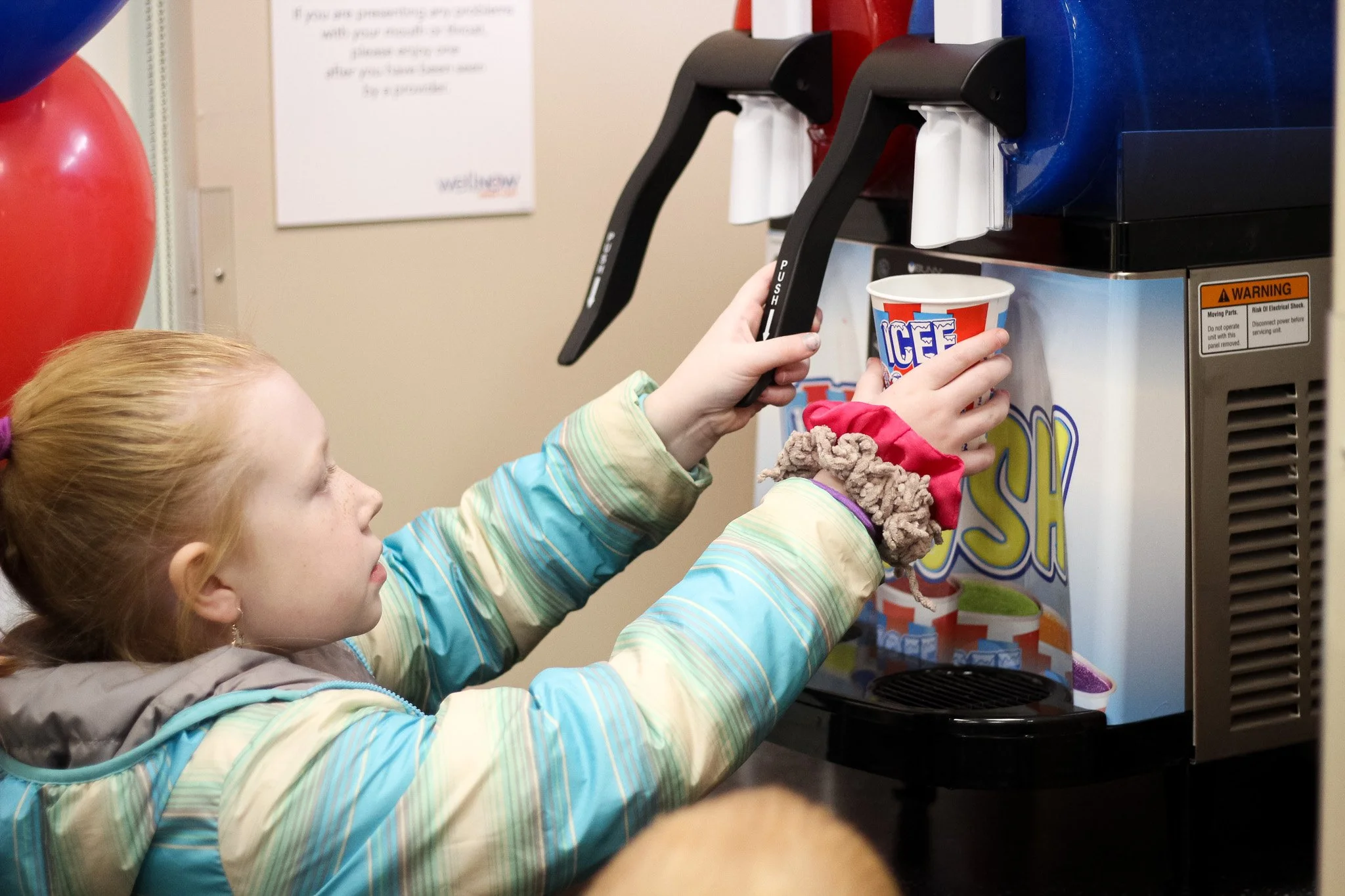
One of the differentiators of this urgent care brand was the emphasis on patient care. They offered industry-standard features like real-time wait times on their website and online appointment reservations, but once patients arrived at one of their locations, the experience was unlike any other clinic.
Facilities featured spacious waiting and exam rooms, free wi-fi, coffee and slushie machines, arcade cabinets, televisions, and more.
IN SEASON.
YEAR ROUND.
My seasonal approach to content allowed us to discuss a wide range of the urgent care services available. If Cold & Flu season lasted longer, I had the flexibility to extend that content. But if summer arrived sooner than expected, I could pivot to talking about proper skin care and hydration techniques for the warmer months.
All while reminding potential customers that WellNow was there for them if they needed it.
As the content planning grew, I worked on infusing more of the brand’s identity into the visuals - utilizing brand colors and logos when it felt natural to do so.