
PUBLIC ESPRESSO + COFFEE
BRAND IDENTITY - Coffee nerds. Experts but not snobby about it.
COLOR
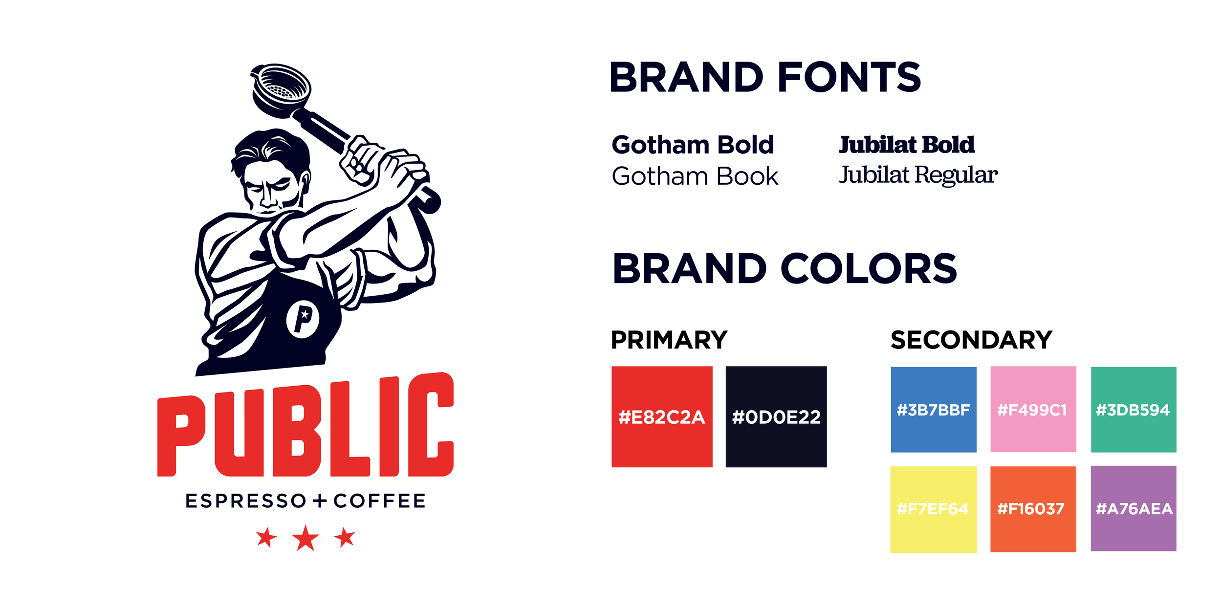
The brand’s primary colors - white, black, and red - are used in logo lockups and other forward-facing materials like websites, social media profiles, signage, etc.
Secondary colors are utilized in supporting materials like product labels, social media graphics, and in-store artwork.
IDENTITY
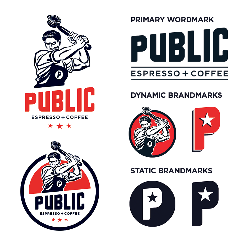
The initial inspiration for Public’s brand was rooted in wartime worker propaganda. The name ‘Public’ came from the term public houses, which were community gathering spots before cafes and restaurants existed. Like the propaganda that inspired it, the logo displays a sense of strength and confidence, but there’s also a sense of humor about it as they character wields an espresso portafilter in lieu of a sledgehammer.
Rather than identifying as “Coffee Snobs,” we described ourselves as “Coffee Nerds.” This lent itself to the idea that we were knowledgeable and approachable about our craft.
The logo received a refresh in 2016 in following a creative exercise with the agency Block Club. Since then, I have developed brand standards and new implementations for the various logo lockups, wordmarks, and brand marks.